One of the biggest complaints about content marketing is, “How am I supposed to create high-quality content…how do I do content right?”
The solution is equal measures of time management, commitment and the ability (aptitude) to know your customers well enough to create interesting stuff for them.
I’m a big fan of creating a community around a brand, whether it’s a business or an individual.
Flags are symbols of communities. They can be a signaling device to members and often a motivation to rally even more support from non-members.
Content is the flag you wave to attract customers.
Flags are more than colored pieces of cloth with differing designs. Flags carry with them the ethos of the people who make and adopt them, for better or for worse.
Content is more than just words, images, and video. Content carries with it the value a brand or individual brings to the table and the lasting effect it has on customers, for better or for worse.
Much like a flag, quality content carries with it a characteristic spirit of a culture and a community’s beliefs and aspirations. High-quality, original content improves search visibility and builds reputations.
Do content right with tips from a vexillologist.
I saw a TED talk from Roman Mars recently on why city flags may be the “Worst-designed thing you’ve never noticed.” Roman is one of the world’s most creative people and he got me thinking about how content can often do the opposite of what people intend for it to do.
He introduced a word, or rather the name of a profession, that I’d never heard before, Vexillology. A vexillologist studies flags and their cultural, historical, political, and social significance. A vexillologist is a flag design expert.
A flag serves as a banner for people to rally under to face the important things.
Content serves as a conduit for consumers to rally under to connect with their preferred brands; to learn more about what’s important to them. Content emerges in search and social media as a beacon to guide would-be buyers to the right decision.
Some people believe that good design is just a matter of taste. Sometimes that’s true…and sometimes it’s not.
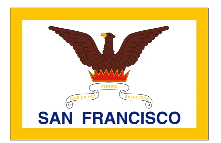
In his TED Talk, Roman gives the viewers an example of bad design using the City of San Francisco’s flag. This is the current flag today.
- The banner is unreadable.
- The city’s name is prominent, defeating the purpose of symbolism.
- The phoenix illustration has the qualities of a 5th-grade art student.

Now consider the suggested revision. Clean, simple, impressive and memorable…all within a short glimpse. Note to San Francisco: Hey, it’s time to wake up and use this far superior design!

Great design and great content have similar attributes:
- Original
- Accessible
- Functional
- Emotionally resonant
- Well made
- Socially beneficial
- Enduring
Not all content is created equal.
The purpose of content is to create and keep a customer.
Even though the details may be subtle, customers know when content hits the mark. The result is they like what they see and they want to know more. They remember it and tell their friends.
Technology continues to be integrated into everything we do and design awareness is at an all-time high. When we don’t have a good representation, we leave it to others (competitors) to design for us.
In Roman’s TED Talk, he mentions the North American Vexillological Association’s guide to good flag design called “Good Flag, Bad Flag.” It covers the five basic design principles that make a good flag. These principles can seem rather ordinary or commonplace, but details are what make a good design, great.

The same five principles can be used in content design. Well-designed content hits the mark. Poorly designed content, often seen in tactical maneuvers carried out without goals and strategies, misses the mark.
5 Essential Principles of Superior Content Design
If you don’t happen to know any vexillologists, you’re in luck! I’ve crafted a list here of those flag-design guidelines and reinterpreted them for content designers. Here are the components to successfully attract customers through great content.
1. Keep it Simple
If you want your content to become authoritative and trustworthy, keep the core message clear and simple.
You don’t have to get fancy. In fact, some of the best content comes from answers to simple questions that customers ask. “They ask, you answer” can lead to meaningful conversations.
It’s estimated that most Americans are exposed to between 4,000 and 10,000 advertisements each day. 81% of those messages contain more written or verbal content than is necessary, encouraging people to tune out, gloss over and move on.
People trust simplicity.
In today’s digital world of information overload and short attention spans, the credibility conveyed by simple messaging is greater than ever.
2. Use Meaningful Symbols
Consumers want a more personal connection in the way they gather information. Our brains are far more engaged by storytelling than by cold hard facts.
What interesting things happened to you today? I have a new client who’s just beginning to recognize great content ideas throughout his day. He brings his dog to work and he now realizes how many great connections he’s made with just having his dog by his side.
Our greedy little brains are hungry for a good story, so if you want to make the sale, construct meaningful content and make a personal connection.
3. Use 2-3 Colors
Content that isn’t seen has zero ROI.
Getting people to click on your content is only half the battle. Keeping them engaged is how you win the sale. If you’re using images and graphics, 2-3 colors is quite literally a best practice.
In written content, your “colors” are words and form. Remember, you’re competing with all the other distractions customers have in their lives. How will you compete? By making it easy to scan and consume.
- Allow each sentence to lead into the next.
- Scannable layout.
- Meaningful subheadings.
- One idea per paragraph.
- Concise text.
- Bullet points.
- Use images to illustrate complex concepts.
With video content, resist the impulse to waste people’s time with long-winded, poor quality content. I’ve seen a lot of this lately, especially with Facebook Live. Pro Tip: Think about your viewers and respect their attention.
Pro Tip: Think about your viewers and respect their attention.
4. No “Lettering or Seals”
If you need to promote the name of your company or product on your “flag” (content), you’ve missed the symbolism aspect entirely.
There’s an oft-forgotten component of today’s social and digital marketing which is the science behind why humans choose certain brands over others. Great content influences and persuades without conspicuous self-centeredness.
The use of hard-sell language in content design defeats its purpose. Blatant ads or spammy messages within your content will only serve to alienate. Let your expertise shine through. There are right times and wrong times to ask for the sale and timing is everything.
Remember: your brand is no longer what you tell consumers it is. It’s what consumers tell each other it is.
5. Be Distinctive
There is an overwhelming amount of content published on the web every minute – good, bad and everything in between. Your content (just like your company or product) must stand out amongst the noise.
Great content design communicates a company’s or individual’s point of view, expertise and value. Ask yourself these two questions:
- What’s the message I want to convey to the reader?
- Does the reader come away thinking my content was written specifically for them?
The flag below was created to convey one message: to scare people so much that they didn’t fight. One certainly can’t accuse it of lacking distinctiveness.

To this day, most everyone who sees this flag knows exactly what it means. Although for some of us that grew up in Southern California, it can conjure up additional thoughts of the Pirates of the Carribean ride at Disneyland. But I digress…
In Conclusion
The purpose of content is to create and keep a customer.
Content is too important to be left to chance. You don’t need a vexillologist to tell you that content is the flag you wave to attract customers and it has to stand out to get noticed. At the heart of content design a motive to serve customers well. Show up to give. Use these 5 principles to do content right, make meaningful connections and ultimately, more sales.
At the heart of great content design is a motive to serve customers well. Show up to give. Use these 5 principles to do content right, make meaningful connections and ultimately, more sales.
